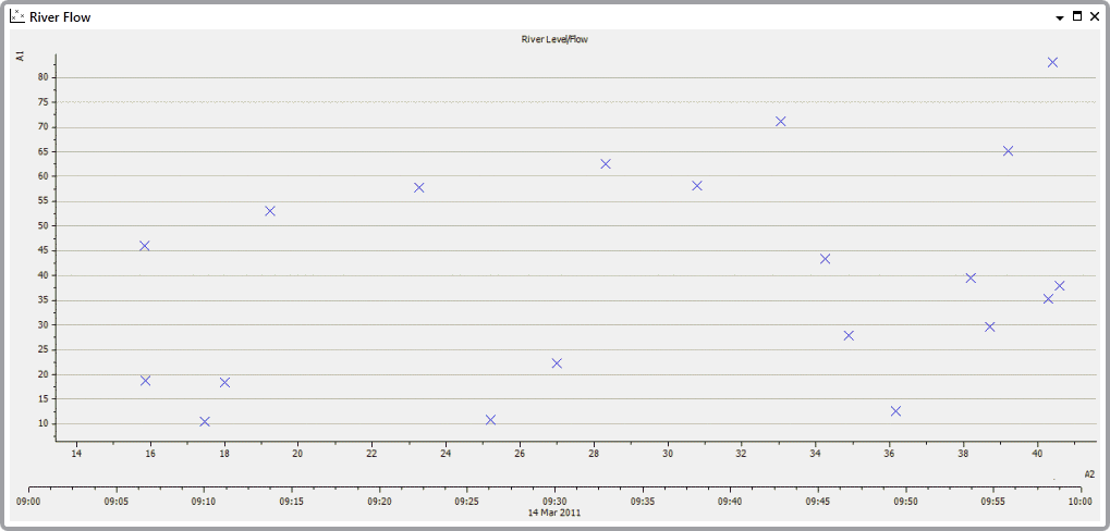
X-Y Plots are special types of Trends that allow you to monitor the relationships between historic values. They are sometimes referred to as ‘scatter graphs’ or ‘scatter plots’ and are used to compare the historic values of related points over time.

Common uses for X-Y Plots include:
- River monitoring—X-Y Plots are used to monitor the relationships between points that monitor water level and points that monitor water flow.
- Wind farms—X-Y Plots are used to monitor the relationships between points that monitor wind speed and points that monitor power generation.
- Water industry—X-Y Plots are used to monitor the relationships between points that monitor alum dosing and points that monitor turbidity.
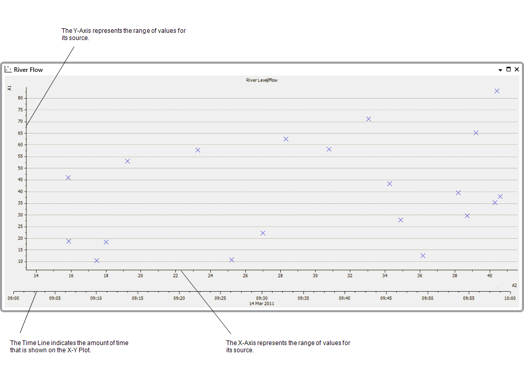
Each X-Y plot consists of:
- X-Axis—Used to plot the historic values from a specified source (typically a point). The X-Axis shows the range of values for the selected source, and the X component of each marker represents a value within the X-Axis range.
- Y-Axis—Used to plot the historic values from a specified source (typically a different point to the source of the X-Axis). The Y-Axis shows the range of values for the selected source, and the Y component of each marker represents a value within the Y-Axis range.
- Time Line—Represents the amount of time shown on the X-Y Plot. This can be increased or decreased as required.

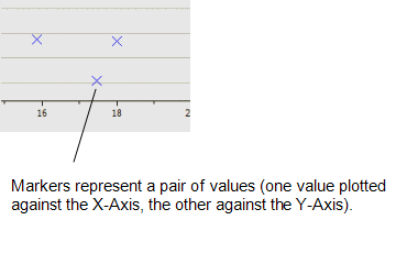
- Markers—Each marker represents two values plotted for a single time; one value for the X-Axis and one value for the Y-Axis. The X component of the marker represents a value on the X-Axis and the Y component represents a value on the Y-Axis.
