When you drag and drop a database item from the Database Bar onto a Mimic, a context sensitive menu is displayed. The options on the context sensitive menu vary according to the type of item you have selected.
The following list describes the possible menu options, but please be aware that some of the options are only available for certain items. For example, the Vertical Bar option is only available for analog points.
- Name—Adds a text box that is animated to show the name of the item (see Text Box Animations).
- Full Name—Adds a text box that is animated to show the full name (including any parent Groups) of the item (see Text Box Animations).
- Hyperlink—Adds a text box that is animated so that it works as a hyperlink to the default display of the item (see Animating an Object to act as a Hyperlink).
- Help View—Adds a text box that is animated so that is works as a hyperlink to the defined Help View of the item (see Animating an Object to act as a Hyperlink).
- Alarm View—Adds a text box that is animated so that is works as a hyperlink to the defined Alarm View of the item (see Animating an Object to act as a Hyperlink).
- Alarm State—Adds a text box that is animated so that it displays the current alarm state of the item (see Text Box Animations).
- Value
- Value—Adds a text box that is animated so that it displays the current value of the item (see Text Box Animations).
- Formatted Value—Adds a text box that is animated so that it displays the current formatted value of the item (see Text Box Animations).
- Vertical Bar—Adds a vertical bar that ‘fills’ according to the current value of the item (see Fill Animations).
- Up—The proportion of the bar that is ‘filled’ represents the current value of the item. The minimum possible value corresponds to the bottom of the bar and the maximum possible value corresponds to the top of the bar.

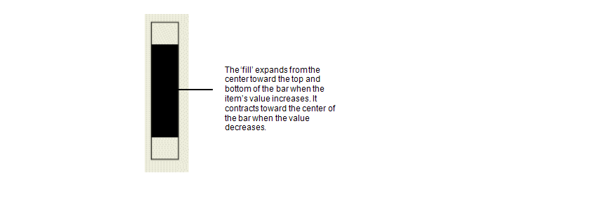
- Center—The proportion of the bar that is ‘filled’ represents the current value of the item. The minimum possible value corresponds to the center of the bar and the maximum possible value corresponds to the top and bottom of the bar. So when the value is low, the ‘fill’ is close to the center, and when the value is high, the ‘fill’ expands from the center to reach closer to the top and bottom of the bar.

- Down—The proportion of the bar that is ‘filled’ represents the current value of the item. The minimum possible value corresponds to the top of the bar and the maximum possible value corresponds to the bottom of the bar.
- Up—The proportion of the bar that is ‘filled’ represents the current value of the item. The minimum possible value corresponds to the bottom of the bar and the maximum possible value corresponds to the top of the bar.
- Horizontal Bar—Adds a vertical bar that ‘fills’ according to the current value of the item (see Fill Animations).
- Left—The proportion of the bar that is ‘filled’ represents the current value of the item. The minimum possible value corresponds to the left of the bar and the maximum possible value corresponds to the right of the bar.

- Center—The proportion of the bar that is ‘filled’ represents the current value of the item. The minimum possible value corresponds to the center of the bar and the maximum possible value corresponds to the left and right of the bar. So when the value is low, the ‘fill’ is close to the center, and when the value is high, the ‘fill’ expands from the center to reach closer to the left and right of the bar.

- Right—The proportion of the bar that is ‘filled’ represents the current value of the item. The minimum possible value corresponds to the right of the bar and the maximum possible value corresponds to the left of the bar.
- Left—The proportion of the bar that is ‘filled’ represents the current value of the item. The minimum possible value corresponds to the left of the bar and the maximum possible value corresponds to the right of the bar.
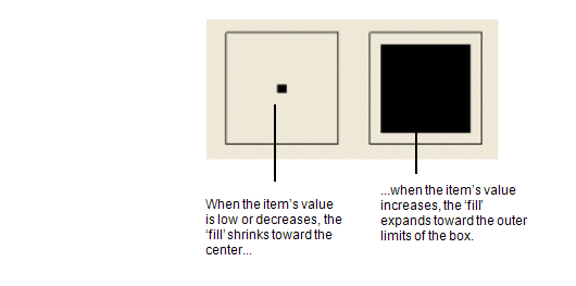
- Sized Box—Adds an animated sized box to the Mimic (see Size Animations). The outline of the box represents the maximum value and an inner ‘fill’ represents the current value of the item. So when the item has a low value, the ‘fill’ is small and in the center of the box, and when the item’s value is high, the ‘fill’ is large and expands closer to the boundaries of the box.

- Default View—Adds a text box that is animated so that is works as a hyperlink to the defined Default View of the item (see Animating an Object to act as a Hyperlink).
- Embedded Mimic—Adds an embedded version of the selected Mimic onto the currently displayed Mimic (see Embed a Mimic on a Mimic).
- Embedded Trend—Adds an embedded version of the selected Trend onto the Mimic (see Embed a Pre-Configured Trend on a Mimic).
- Embedded X-Y Plot—Adds an embedded version of the selected X-Y Plot to the Mimic (see Embed an X-Y Plot on a Mimic).
- Embedded X-Y-Z Plot—Adds an embedded version of the selected X-Y-Z Plot to the Mimic (see Embed an X-Y-Z Plot on a Mimic).
- Embedded Dynagraph—Adds an embedded version of the selected Dynagraph to the Mimic (see Embed a Dynagraph on a Mimic).
- Current Value—Adds a text box that is animated so that it displays the current value of the item (see Text Box Animations).
- Quality—Adds a text box that is animated so that it displays the current quality of the item (see Text Box Animations).
- Last Updated—Adds a text box that is animated so that it displays the time stamp of the most recent update to the item’s value (see Text Box Animations).
- State—Adds a text box that is animated so that it displays the current state of the item (see Text Box Animations).
- Previous Value—Adds a text box that is animated so that it displays the previous current value of the item (see Text Box Animations).
- Previous Quality—Adds a text box that is animated so that it displays the previous quality of the item (see Text Box Animations).
- Previous Updated—Adds a text box that is animated so that it displays the previous last updated time stamp of the item (see Text Box Animations).
- Previous State—Adds a text box that is animated so that it displays the previous current state of the item (see Text Box Animations).
- Color—Adds a rectangle that is animated so that its fill and line color represent the state of the item. The rectangle is also animated to flash (see FillColour).
- Last Executed—Available for use with Schedules, this option adds a text box to the Mimic. The text box is animated so that it displays the time stamp for the previous execution of the schedule (see Text Box Animations)
- Next Execute—Available for use with Schedules, this option adds a text box to the Mimic. The text box is animated so that it displays the time stamp for the next execution of the schedule (see Text Box Animations)
- Duty User—Available for use with User Rosters, this option adds a text box to the Mimic. The text box is animated so that it displays the name of the User or User Group that is currently designated as the Duty User (see Text Box Animations)
- List—Available for use with Data Grids, this option adds an embedded version of the selected Data Grid to the Mimic. The Data Grid is displayed as an SQL List.
- Sinewave—Available only for Random Generators, you can use this option to add a text box that is animated with the Value, a vertical bar, a horizontal bar, or a sized box. In each case, the text or ‘fill’ represents the sinewave value of the random generator item you have selected.
In other respects, the Value, Vertical, Horizontal and Sized Box options work in the same way as the similarly named options from the Value sub-menu (see Value, above).
- Sawtooth—Available only for Random Generators, you can use this option to add a text box that is animated with the value, a vertical bar, a horizontal bar, or a sized box. In each case, the text or ‘fill’ represents the sawtooth value of the random generator item you have selected.
In other respects, the Value, Vertical, Horizontal and Sized Box options work in the same way as the similarly named options from the Value sub-menu (see Value, above).
- Random—Available only for Random Generators, you can use this option to add a text box that is animated with the value, a vertical bar, a horizontal bar, or a sized box. In each case, the text or ‘fill’ represents the random value of the random generator item you have selected.
In other respects, the Value, Vertical, Horizontal and Sized Box options work in the same way as the similarly named options from the Value sub-menu (see Value, above).
- Walk—Available only for Random Generators, you can use this option to add a text box that is animated with the value, a vertical bar, a horizontal bar, or a sized box. In each case, the text or ‘fill’ represents the walk value of the random generator item you have selected.
In other respects, the Value, Vertical, Horizontal and Sized Box options work in the same way as the similarly named options from the Value sub-menu (see Value, above).
Further Information
Alarm Views: see Defining an Item or Group’s Alarm Properties in the ClearSCADA Guide to Core Configuration.
Help Views: see Specify a Help View in the ClearSCADA Guide to Core Configuration.
Alarm States: see Alarm Severity, Status, and Category in the ClearSCADA Guide to Alarms.
Default Views: see Defining a Default View in the ClearSCADA Guide to Core Configuration.
Schedules: see Using Schedules to Automate Regular Functions in the ClearSCADA Guide to Core Configuration.
Duty User: see Specify the Duty User in the ClearSCADA Guide to Alarm Redirection.
Data Grids: see Configuring Data Grids in the ClearSCADA Guide to Core Configuration.